
VISUAL DESIGN · WEB DESIGN · INFORMATION DESIGN
COMIRNATY
HCP DIGITAL
EXPERIENCES
Bringing clarity and consistency to product education, clinical evidence, COVID-19 awareness, and dosing guidance for healthcare professionals.
ROLE
Visual Designer
COLLABORATION
UX Designer
Creative Director
Cross-functional partners
SELECTED PAGES
Home, Impact, About, and Dosing
One system, four
information needs.
01
PRODUCT INTRODUCTIONHome
DISEASE EDUCATIONImpact
The selected work spans product introduction, disease education, clinical evidence, and administration guidance. Each area required a different hierarchy while remaining part of one consistent healthcare professional experience.
My visual design focus was bringing structure to complex medical and regulatory content, helping users identify what mattered, understand how information was related, and move between different levels of detail.
CLINICAL EVIDENCEAbout
ADMINISTRATION GUIDANCEDosing

HOME
Establishing the product experience.
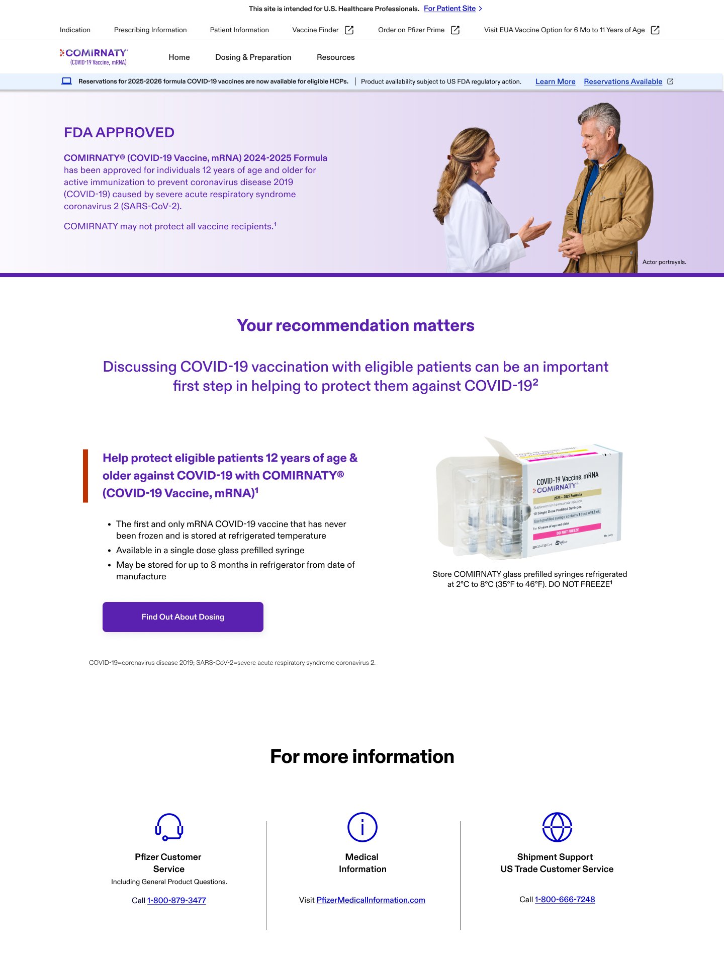
The homepage introduces the approved 2024–2025 formula of COMIRNATY for eligible patients aged 12 and older, then connects the product story with dosing information and healthcare-professional support.
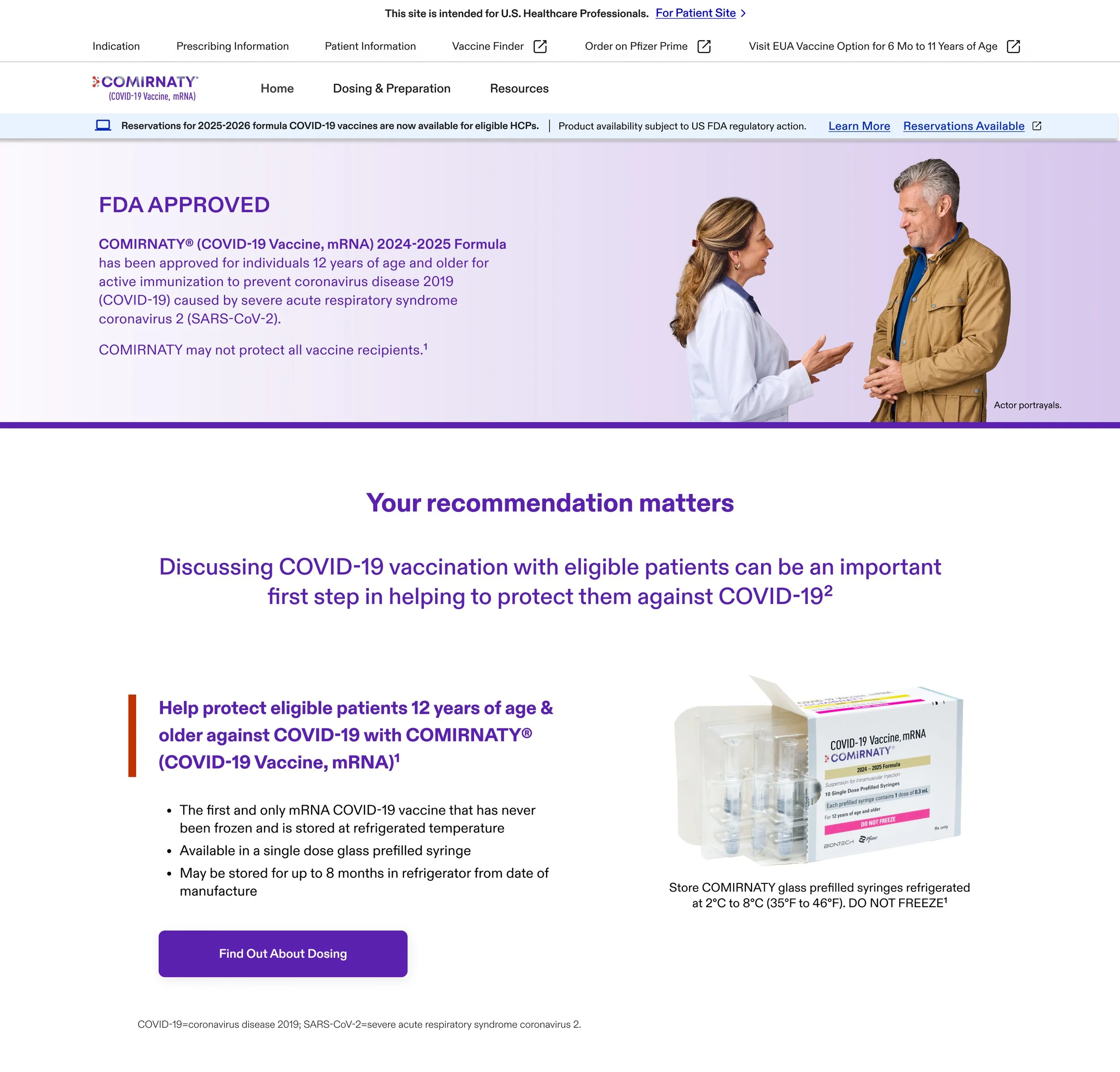
The homepage moves from FDA approval and recommendation messaging into product presentation, dosing, and support resources.

IMPACT OF COVID-19
Moving from awareness
to evidence.
The experience begins with a human, photography led message before transitioning into disease-burden statistics and supporting evidence. Large headlines establish the primary takeaway before users encounter more detailed charts, notes, and references.
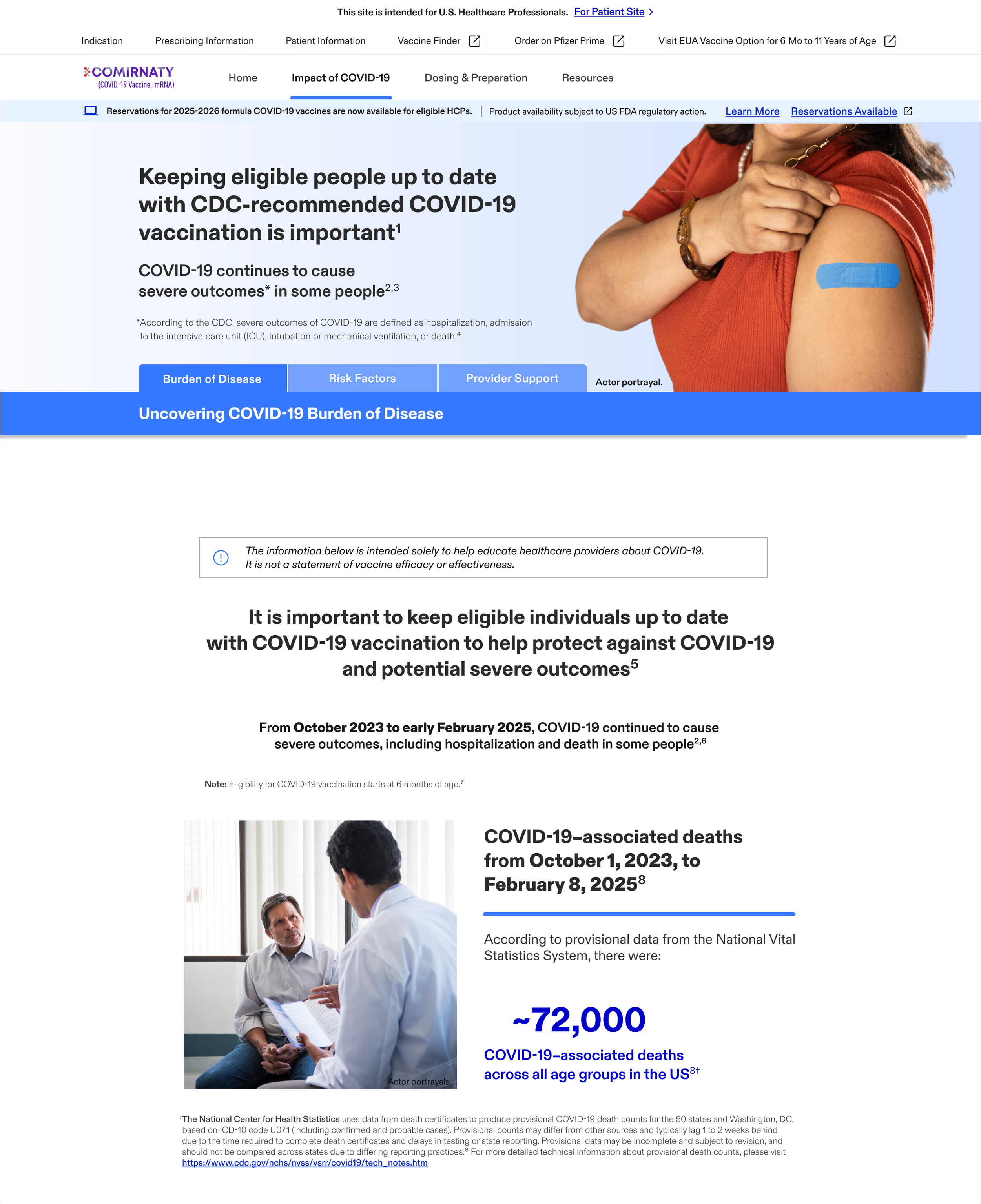
A clear opening moves from the broader burden of disease into a focused mortality statistic.
Making complex data scannable.
02
Trend visualization and headline statistics establish a clear hierarchy across multiple levels of evidence.
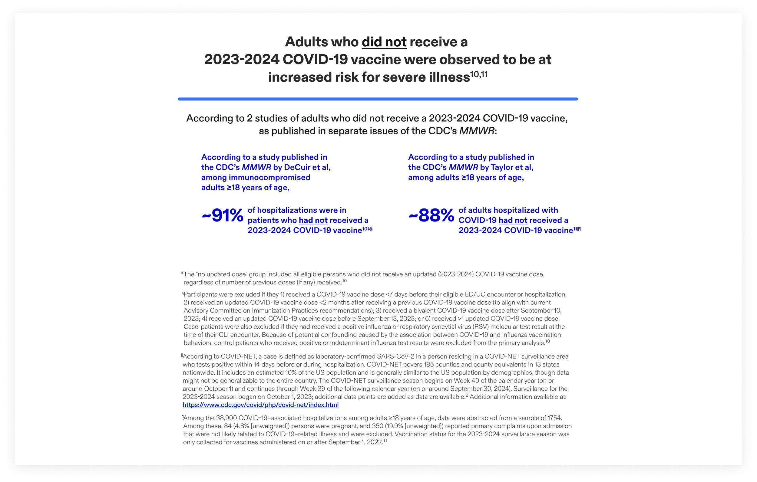
Charts, large percentages, and deliberate spacing create multiple entry points into dense evidence. Supporting notes remain connected to the claims they clarify, allowing the page to surface key findings without separating them from their clinical context.
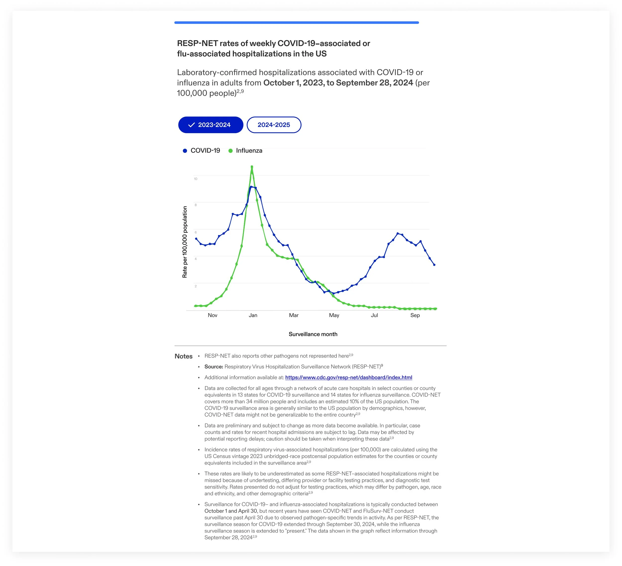
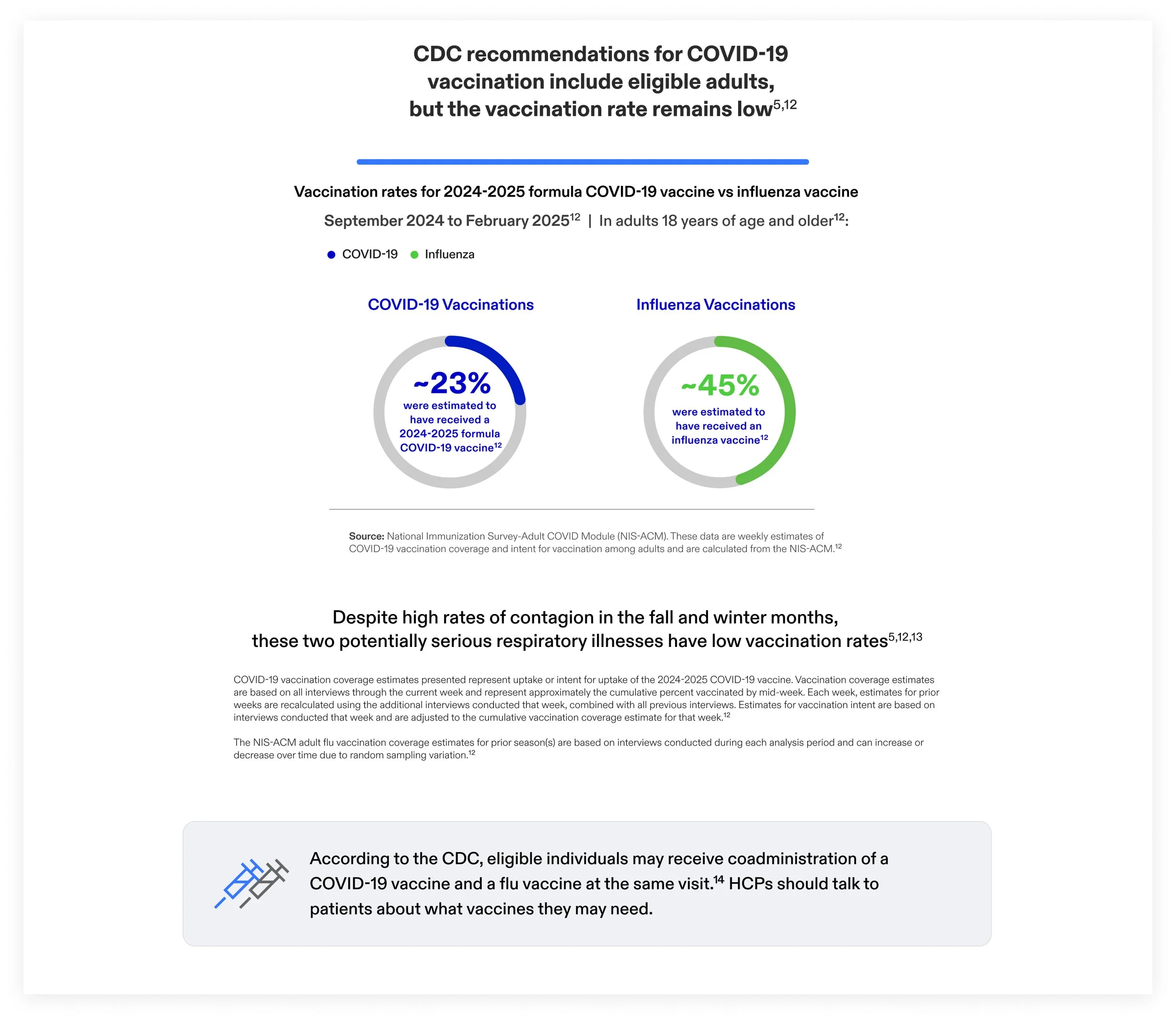
A simple visual comparison makes two vaccination-rate datasets understandable.
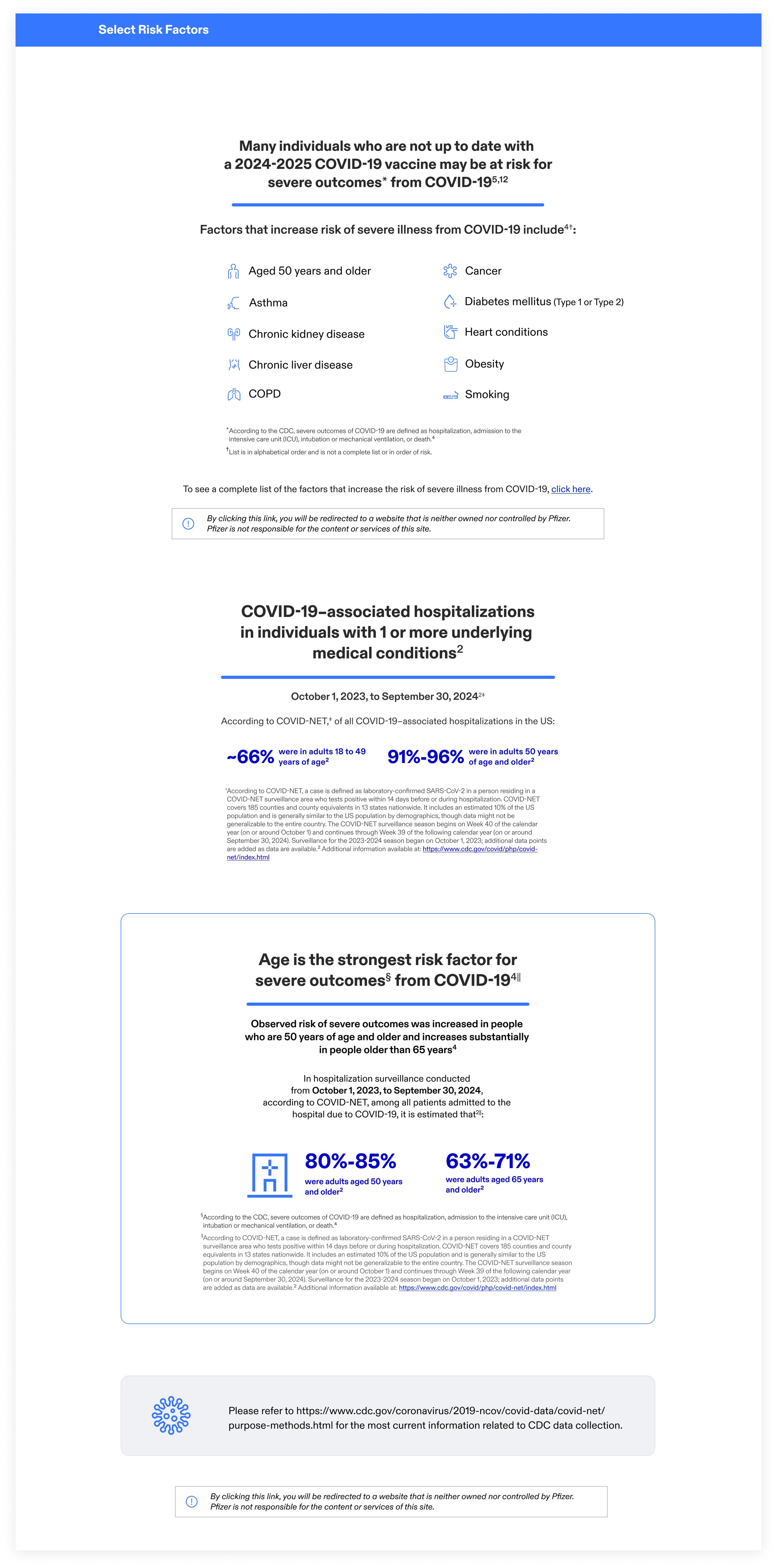
Icons, statistics, and a bordered callout organize increasingly specific risk information.

ABOUT COMIRNATY
Moving from product story to clinical detail.
The About experience introduces the vaccine at a high level, explains how the mRNA technology works, and then leads into trial design, efficacy, and safety. Its visual language becomes progressively more structured as the content becomes more technical.
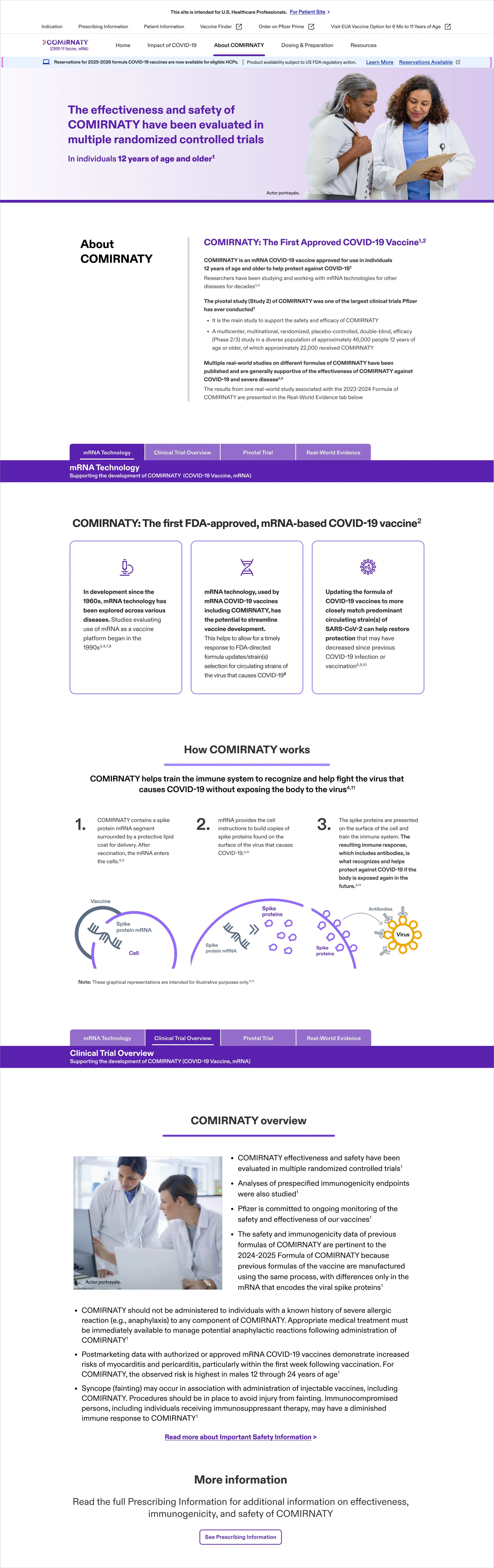
Structuring clinical evidence.
03
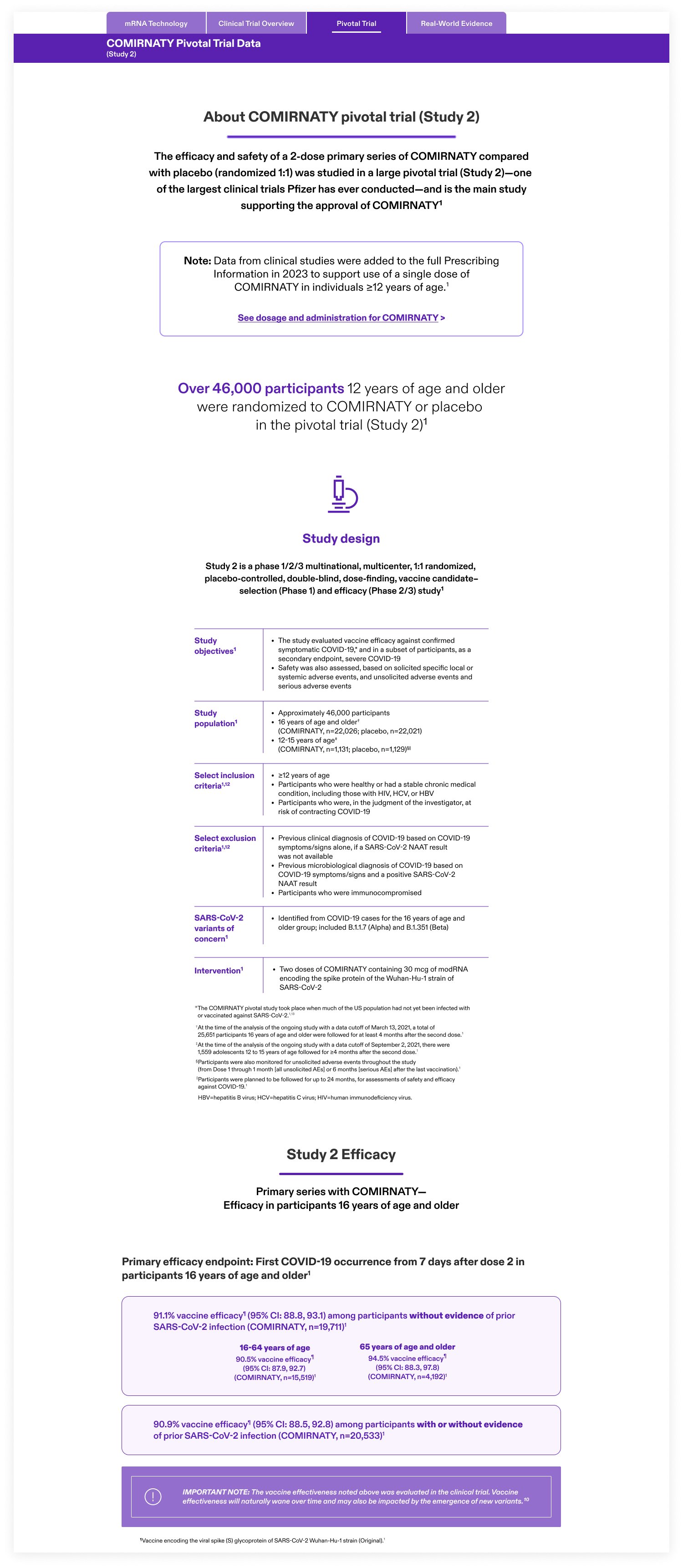
Deeper sections use aligned labels, data rows, bordered evidence modules, and highlighted notes to distinguish study context from key findings. This allows the page to become more technical without feeling disconnected from the broader experience.
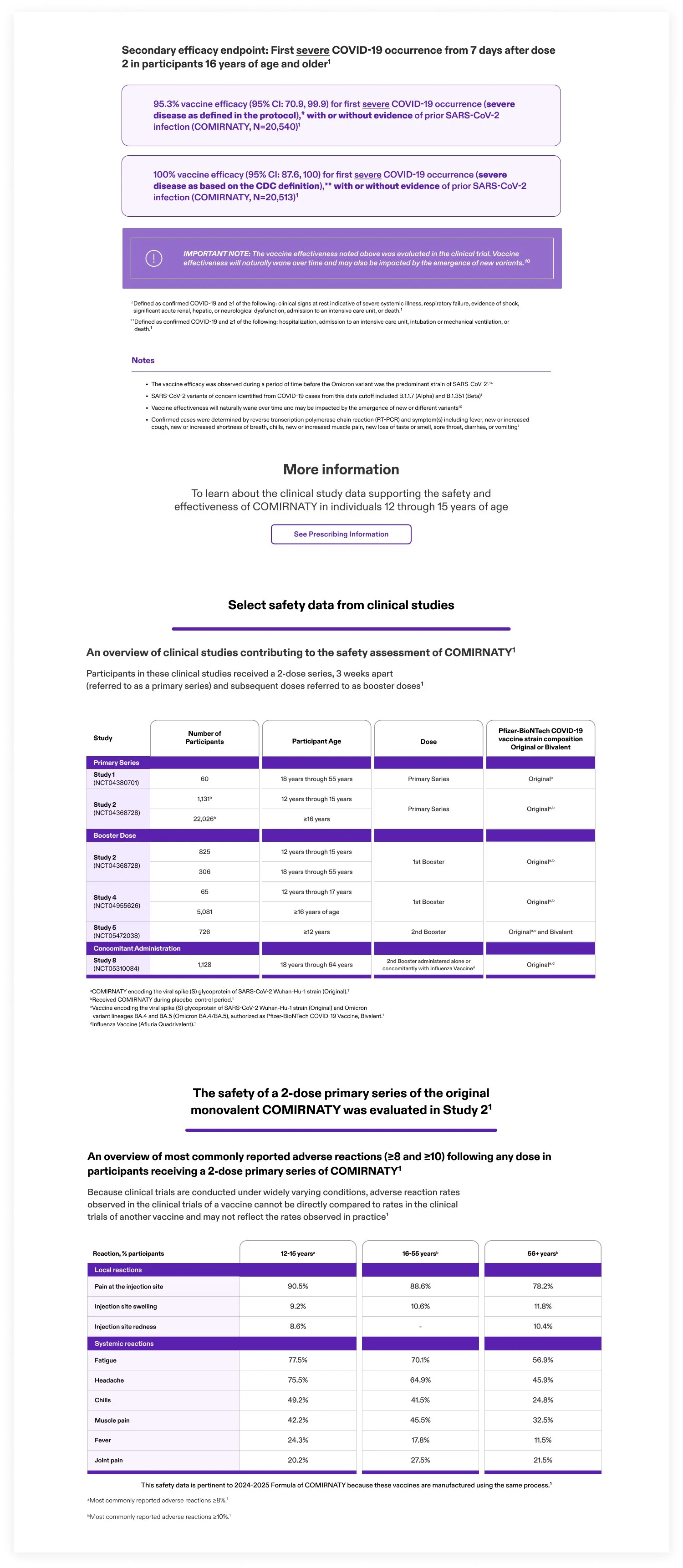
Study design and efficacy content are organized as a deliberate progression rather than one continuous body of text.

DOSING & PREPARATION
Supporting a
practical workflow.
The dosing experience shifts from clinical education to detailed instructional content.
It first establishes the correct product presentation and age group, then moves into storage, preparation, and administration.
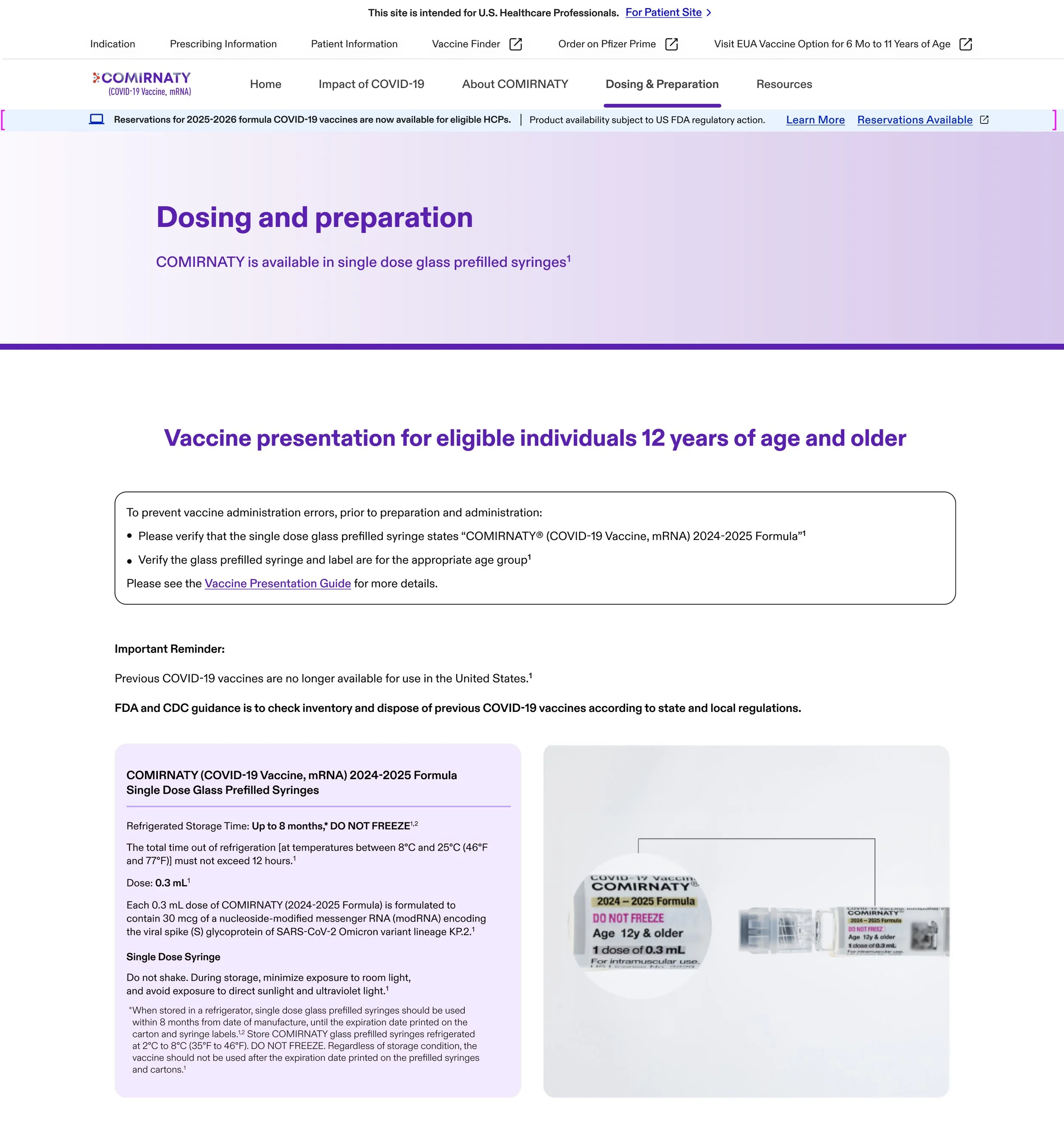
Product imagery and label details establish the correct presentation before the instructional sequence begins.
Making the
sequence visible.
04
Strong section bars divide the workflow into three explicit stages: Verify, Prepare, and Administer. Supporting information remains grouped under the relevant step, keeping the central sequence visible throughout the detailed instructions.
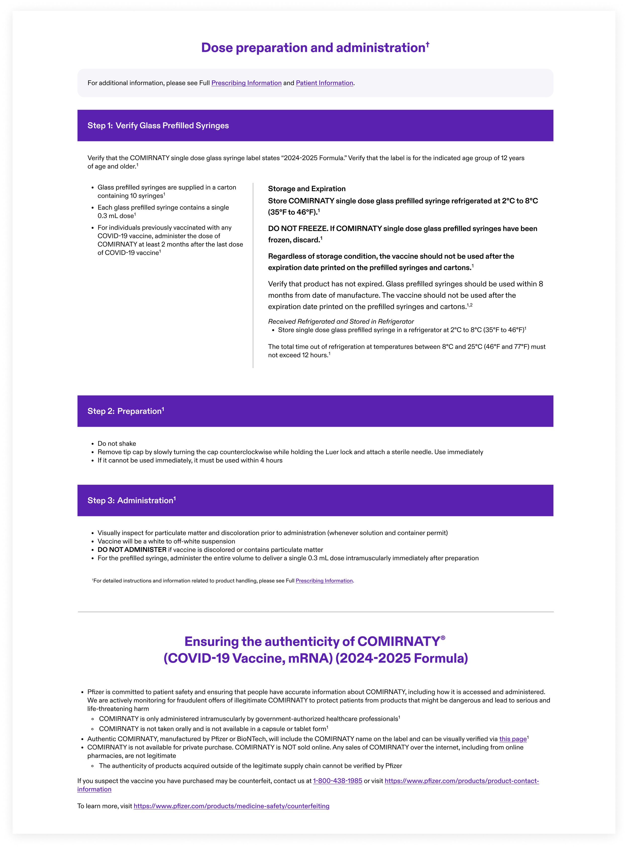
The visual hierarchy keeps the practical workflow visible from beginning to end.

01
Clear hierarchy
Distinct headings and section transitions clarify where to begin.
DOSING & PREPARATION
02
Modular information
Distinct headings and section transitions clarify where to begin.
03
Scannable data
Large statistics and restrained graphics surface important findings.
04
Integrated context
References and safety information remain connected to the experience.
A consistent visual language
for very different content.
Recurring patterns establish familiarity while allowing each page to respond to its own communication needs.

REFLECTION
Designing for different content needs.
Each page required a different approach, from product storytelling and clinical evidence to dosing instructions, while shared typography, components, and navigation kept the experience connected.
The infographic and data-heavy sections were the most challenging parts of this project. Working through them helped me use hierarchy, comparison, and spacing more intentionally to make complex healthcare information easier to scan.