Team
Chelsea Andrews (Creative Director)
Jinhee Hong (Design Lead)
Nixin Weng (Visual Design Intern)
Tool
Figma
Brief
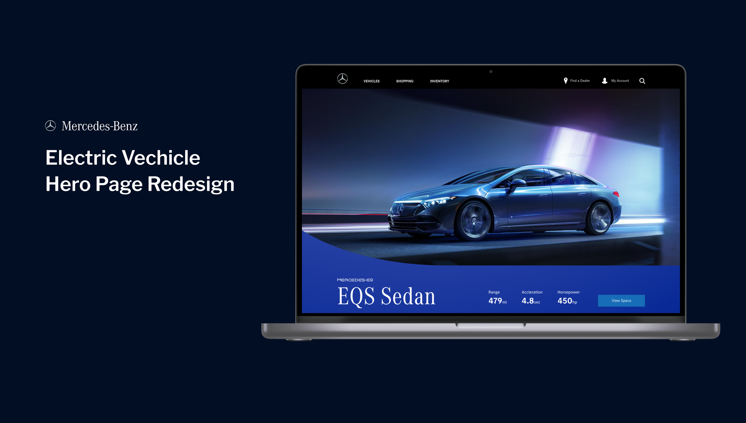
I was given the task to redesign the Mercedes Benz’s Electric Vehicle hero page later turned into the master comps throughout all the hero pages from the live site.
C O M P E T I T I V E A N A L Y S I S + T H E G A PTimeline
4 weeks, summer 2022
Problem
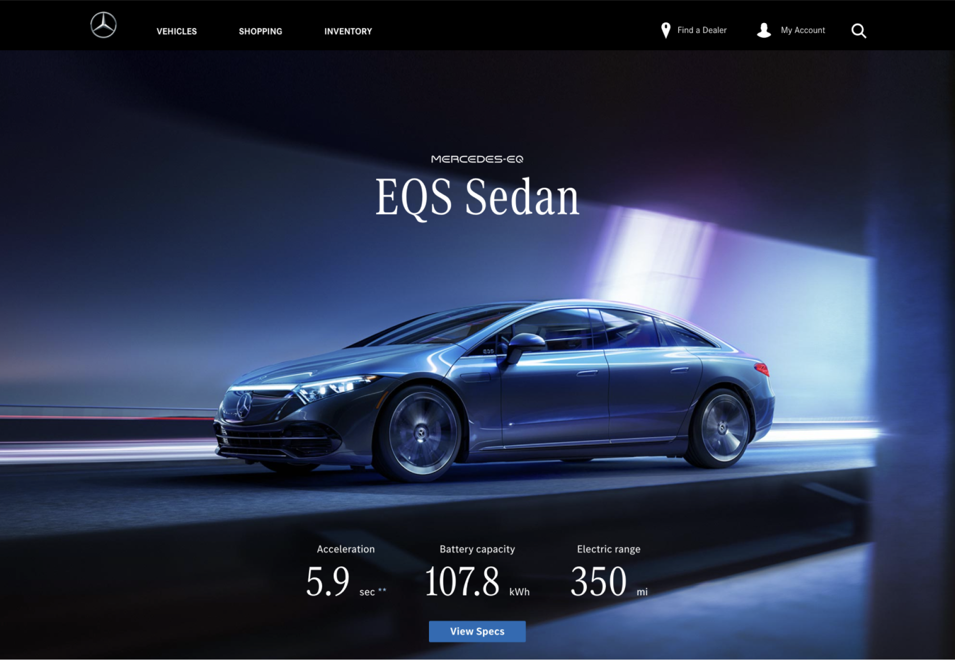
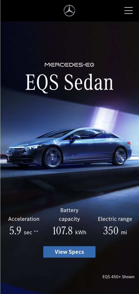
From previous launched EQS hero page design on the MBUSA.com, client discovered the problem of accessibility issue. Since Creative teams had no control over what image Developer team would choose put on the live site, white text on top of the light image won’t pass the ADA test.
Challenges
Discover site visitor’s pain point and make key functions more accessible
Personalize vehicle shopping experience
Design consistent with Mercedes-Benz brand’s design system
Before
EQ Hero Page (Desktop)
EQ Hero Page (Mobile)
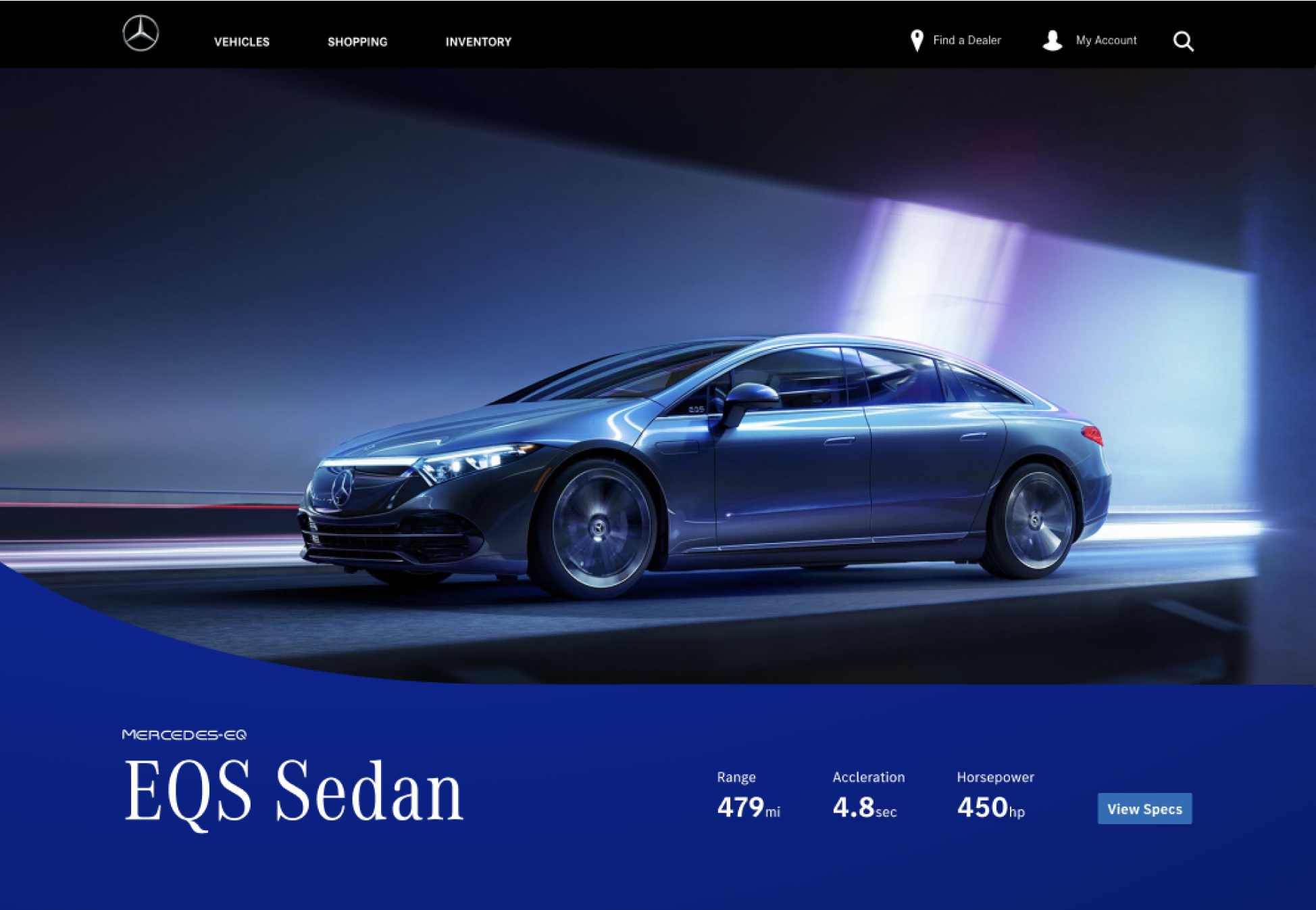
After
EQ Hero Page (Desktop)
EQ Hero Page (Mobile)
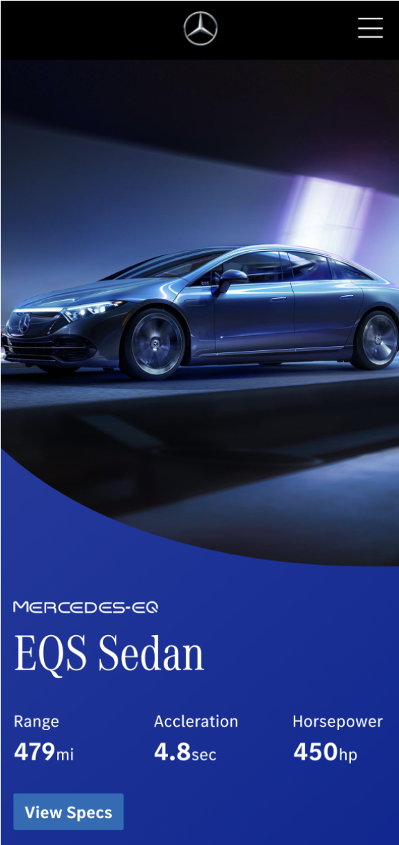
01
Showcase Mercedes-Benz vehicle by itself, but still allows user to see vehicle’s specs
02
Rearranged the brand’s names, vehicle’s name, and specs below the image to fix the ADA issue the original design had
03
Masking the image to include the signature EQ curve to stay consistence with the EQ design system

RESEARCH
Competitive Analysis
Design Approach 2
Single image
Playing around with the EQ logo shape

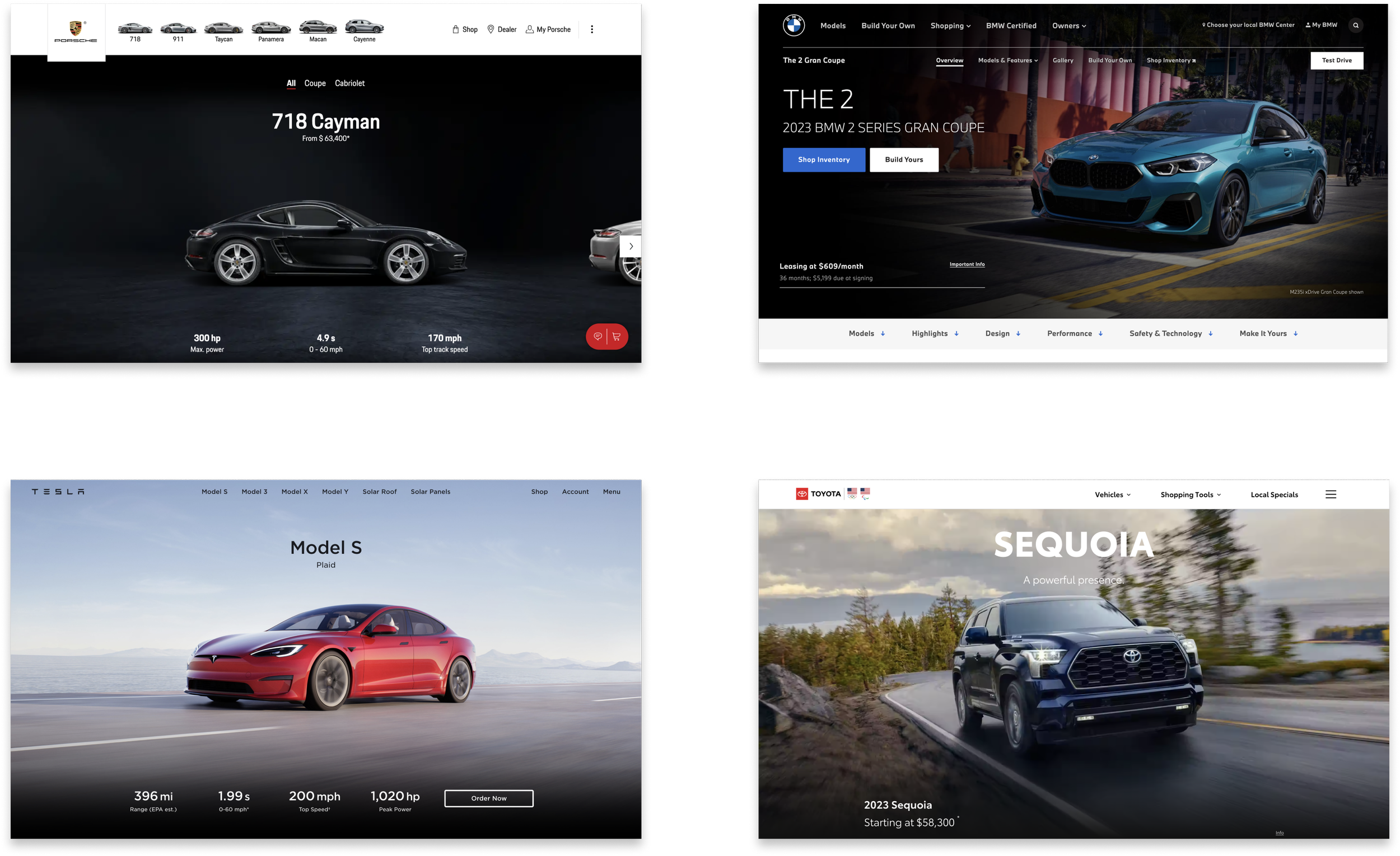
I looked at some competitive’s class page to find inspirations. What I took away were:
DESIGN
Having specs away from the vehicle to best showcase the vehicle
Vehicle specs often appear on the bottom of the page, and on top of the dark background.
ADA issue can be fixed if the text and images are separate out.
Ideation Sketches
Design Approach 3
Using the EQ logo shape to create negative space
Only use vehicle it self, and play with the backplate

Design Approach 1
Multiple images using the imagery carousel

Brainstorm
Based on the competitive analysis and ideation sketches, I started to brainstorm different design solutions. Director also encouraged me to come up with as many ideas as possible without considering feasibility at this stage.
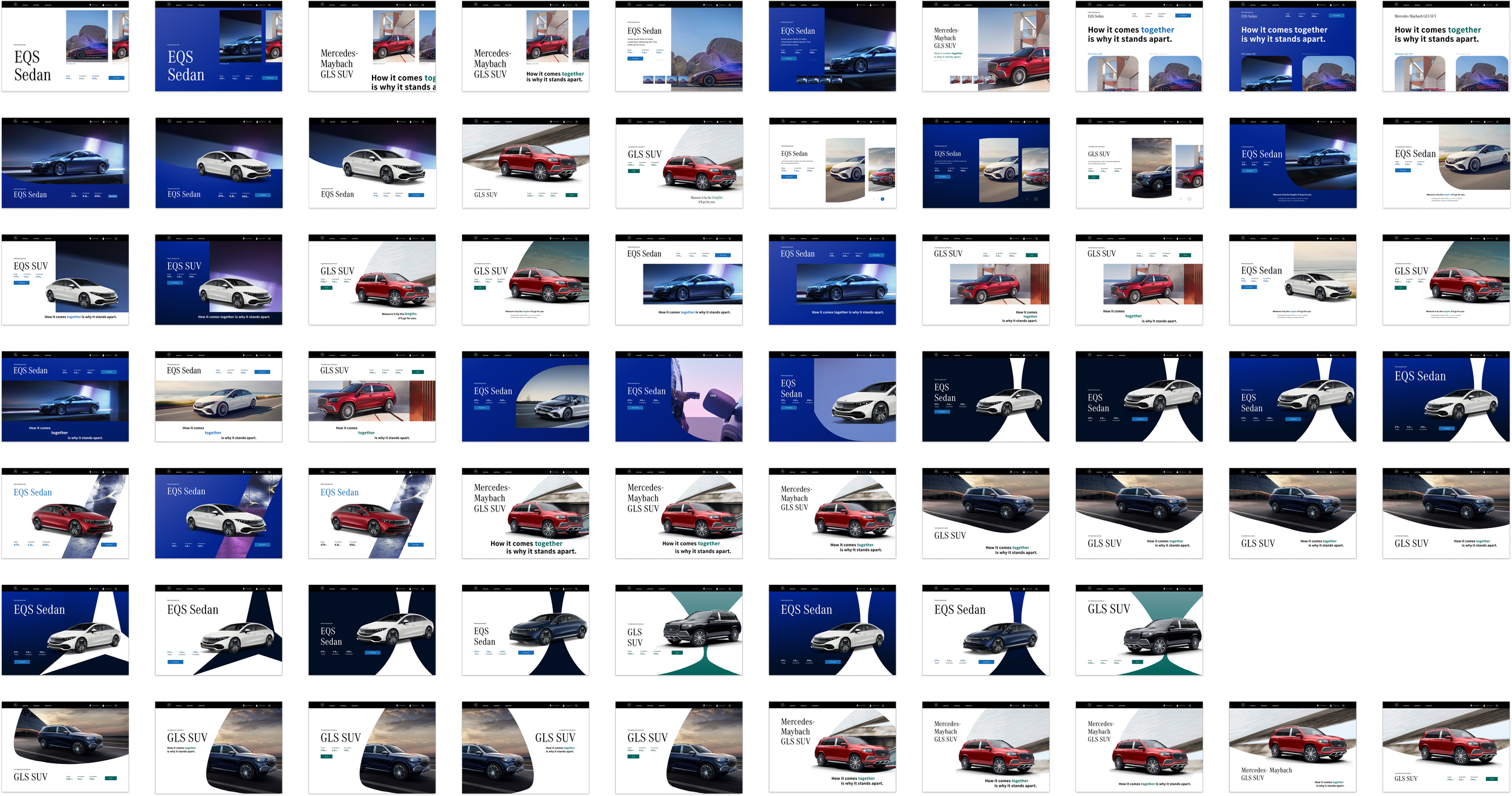
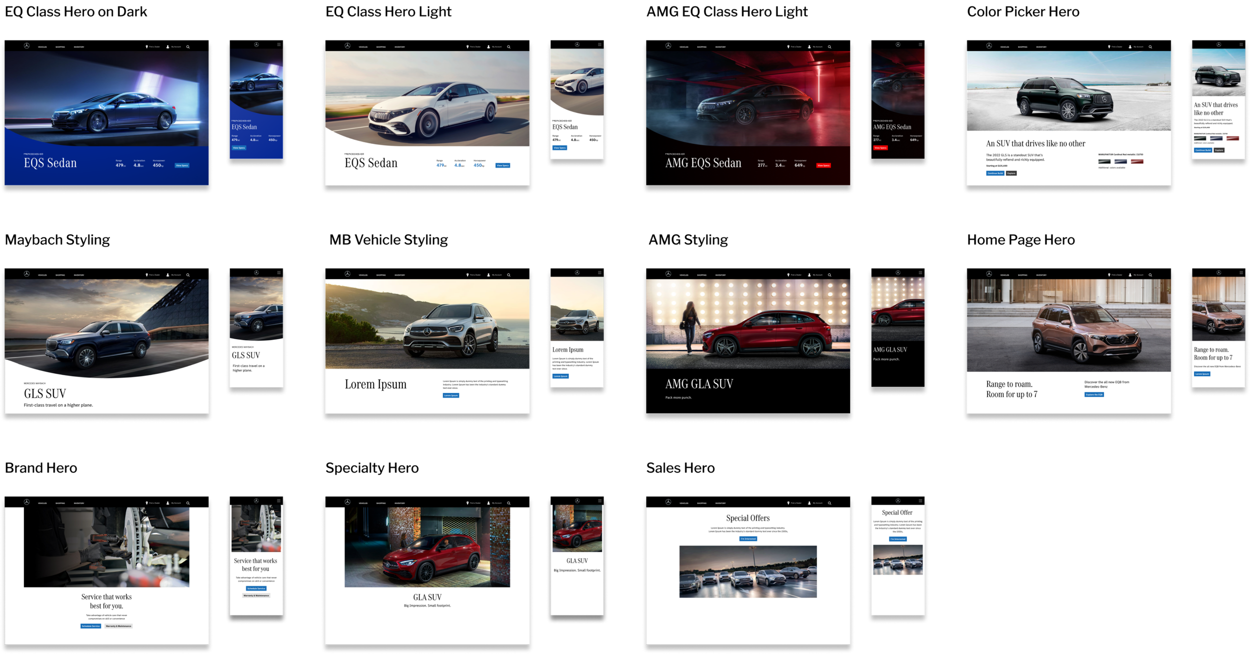
After the EQ Class Hero page redesign was set in stone, the team decided to make the comps
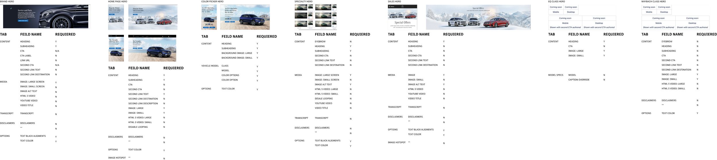
as the master comps for all the HERO pages from the live site. Since every HERO page has different role. I started to analyze the live site, and create 3 levels of design while maintain the theme of EQ Class Page redesign.
Master Comps
Analyze Live Site
Final Design
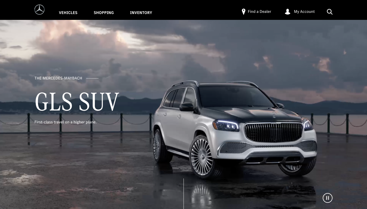
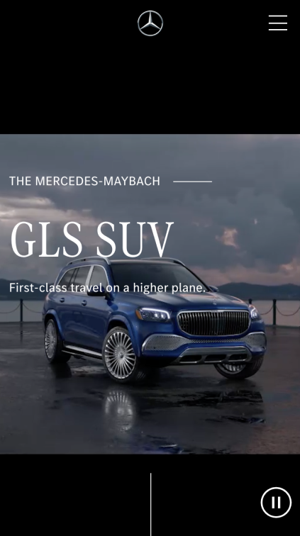
Before
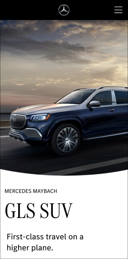
Maybach Class Page (Desktop)
Maybach Class Page (Mobile)
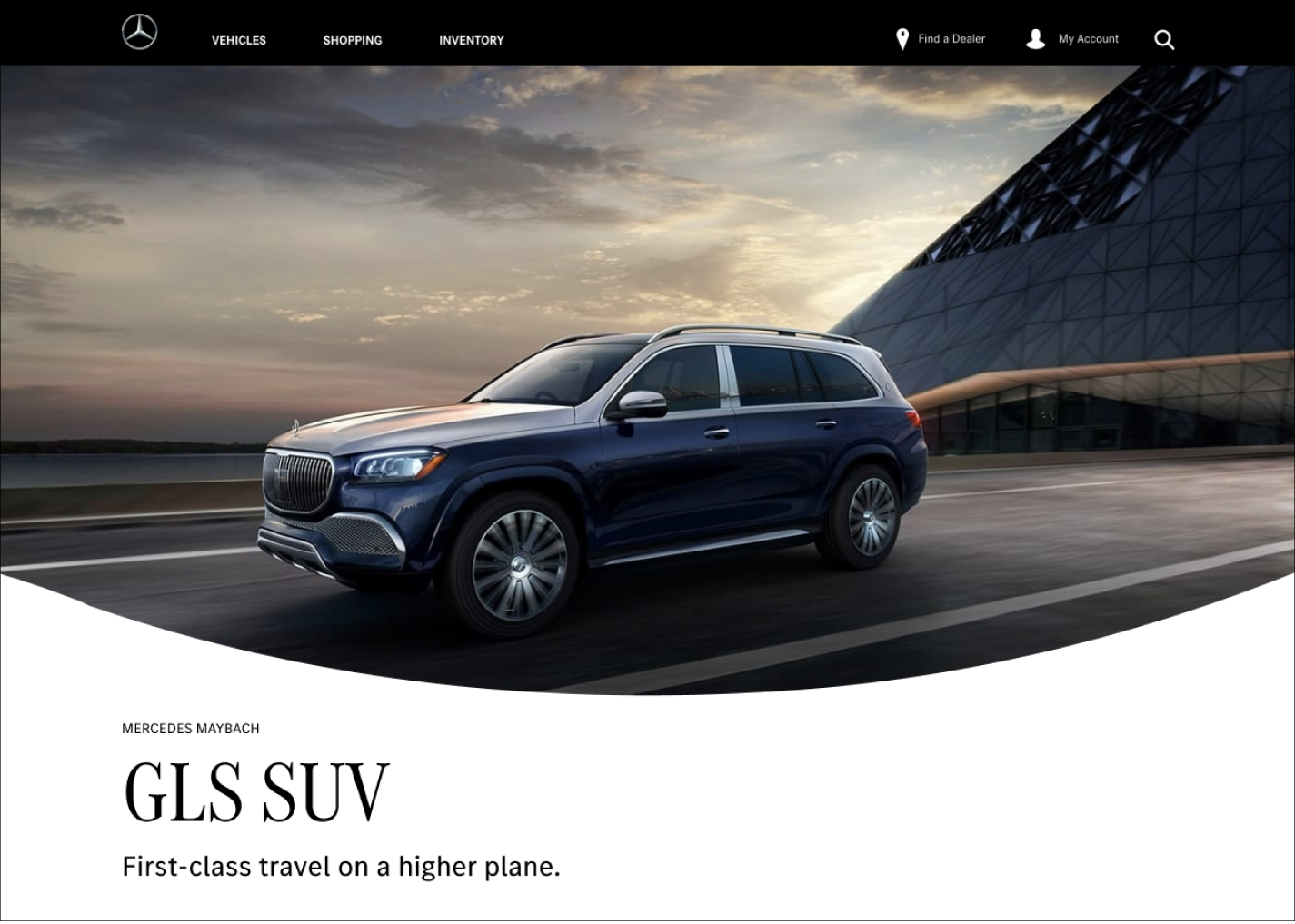
After
Maybach Class Page (Desktop)
Maybach Class Page (Mobile)
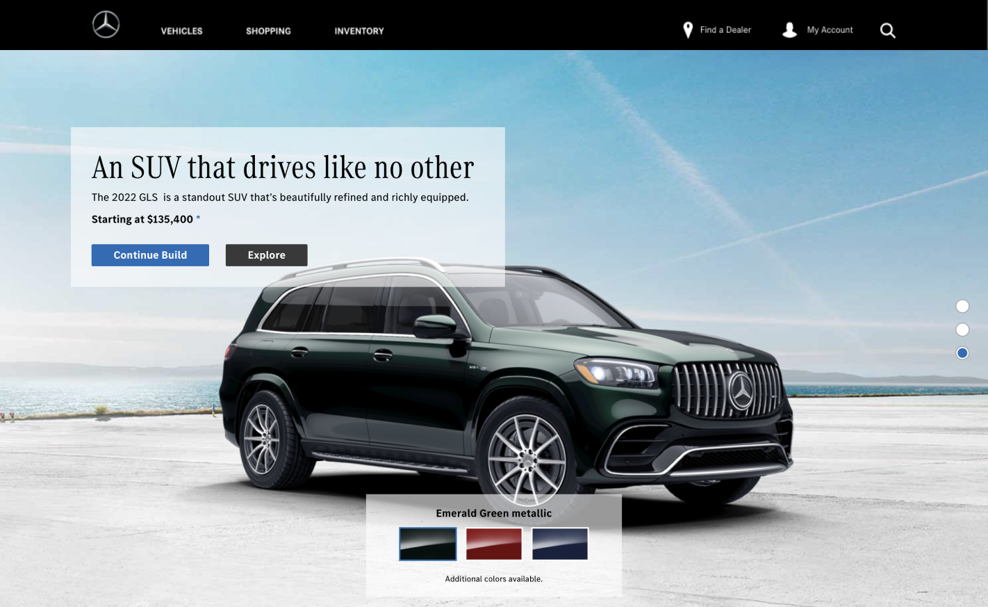
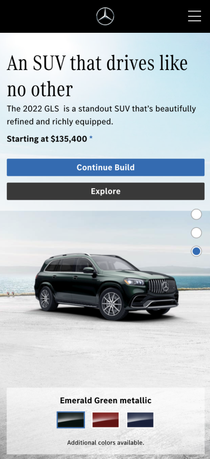
Before
Color Picker Hero Page (Desktop)
01
Color Picker Hero Page (Mobile)
Incorporate Mercedes Maybach water drop logo with the image to match the design system.
02
Switch from a looping video to still image to catch user’s attention.
After
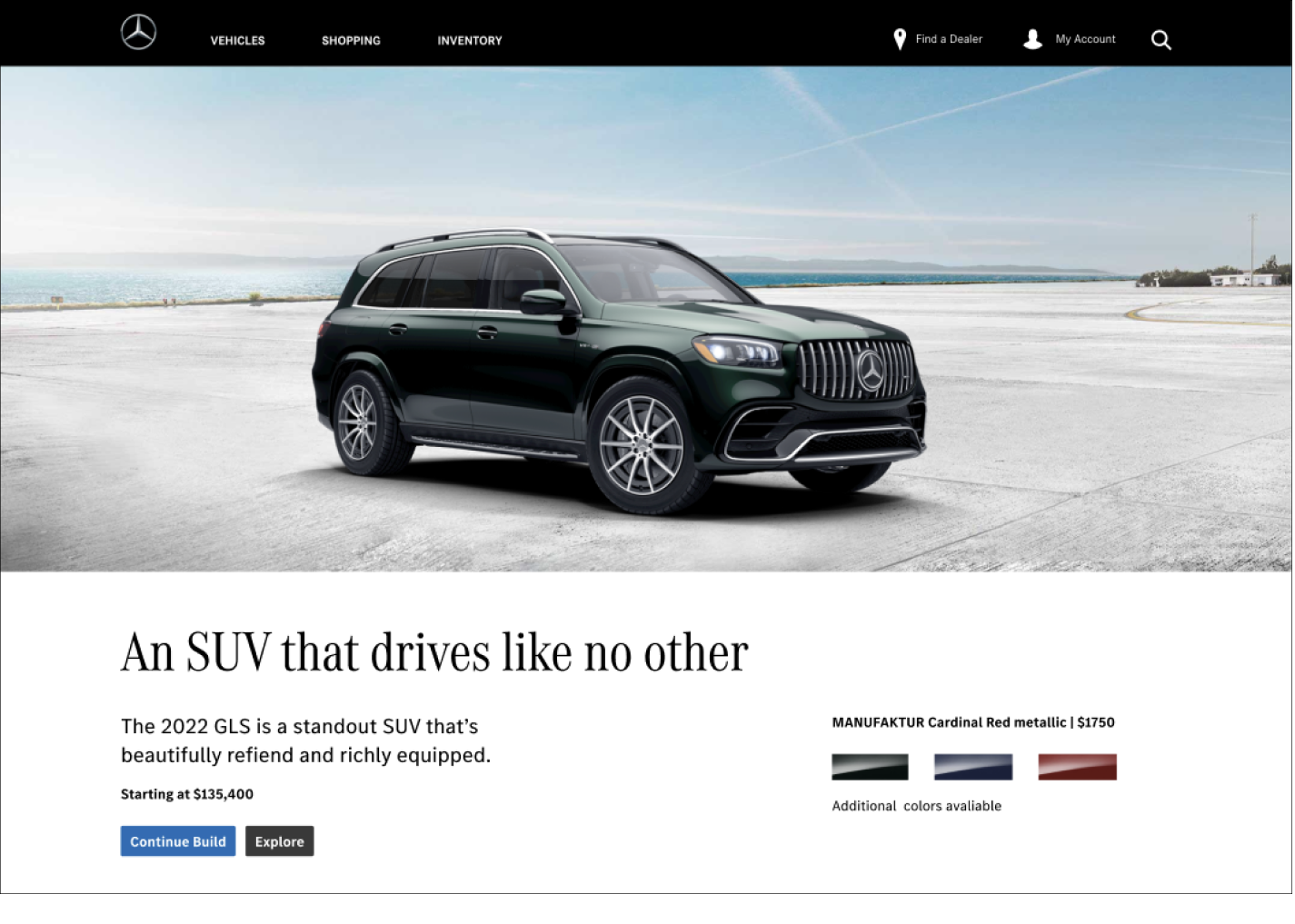
Color Picker Hero Page (Desktop)
Color Picker Hero Page (Mobile)
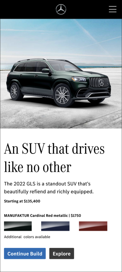
01
Rearranged the copy deck to the bottom, allows user naturally flow to the other parts of the page.
02
Adding the price for different color choices, to help user make quick decisions.

TAKEAWAYS
Handle complexity and ambiguity of a small yet visual-heavy project.
Pay more attention to details on the relationship of the visual components and copy, how to use the right components from the design system.
Consider consistency, accessibility, and adaptability when design a new interface. (See how it fits into the entire website and larger roadmap)
Try wild explorations to the point of failure.
For more work inquiries, or to grab a coffee do email me at
selinaweng1115@gmail.com💫☕️
Thank you for reading!
More Projects: