
USAA CAMPAIGN EXPERIENCE · 2026
250 years of service.
One place to remember.
A visual identity and digital experience created to honor
generations of military service with clarity, dignity, and warmth.
ROLE
TIMELINE
Visual Designer
2 weeks

01 / THE DESIGN CHALLENGE
Holding national scale and
personal meaning.
USAA needed a campaign experience that could honor 250 years of military service without feeling institutional, somber, or sentimental.
MY ROLE
The microsite had to introduce a national monument, guide visitors through millions of public military records, and prepare them for an eventual on-site experience.
Lead the responsive visual design, translating USAA’s evolving brand language into one cohesive campaign system in two weeks.

02 / VISUAL FOUNDATION
A visual language
built to carry weight.
01
Depth, not darkness
Navy gives the work authority and permanence without making it feel somber.
02
Warmth, not sentiment
Cream surfaces and editorial serif accents introduce humanity without nostalgia.
03
Emphasis, not decoration
Gold and motion are reserved for recognition, milestones, and moments of honor.

APPLYING THE LANGUAGE
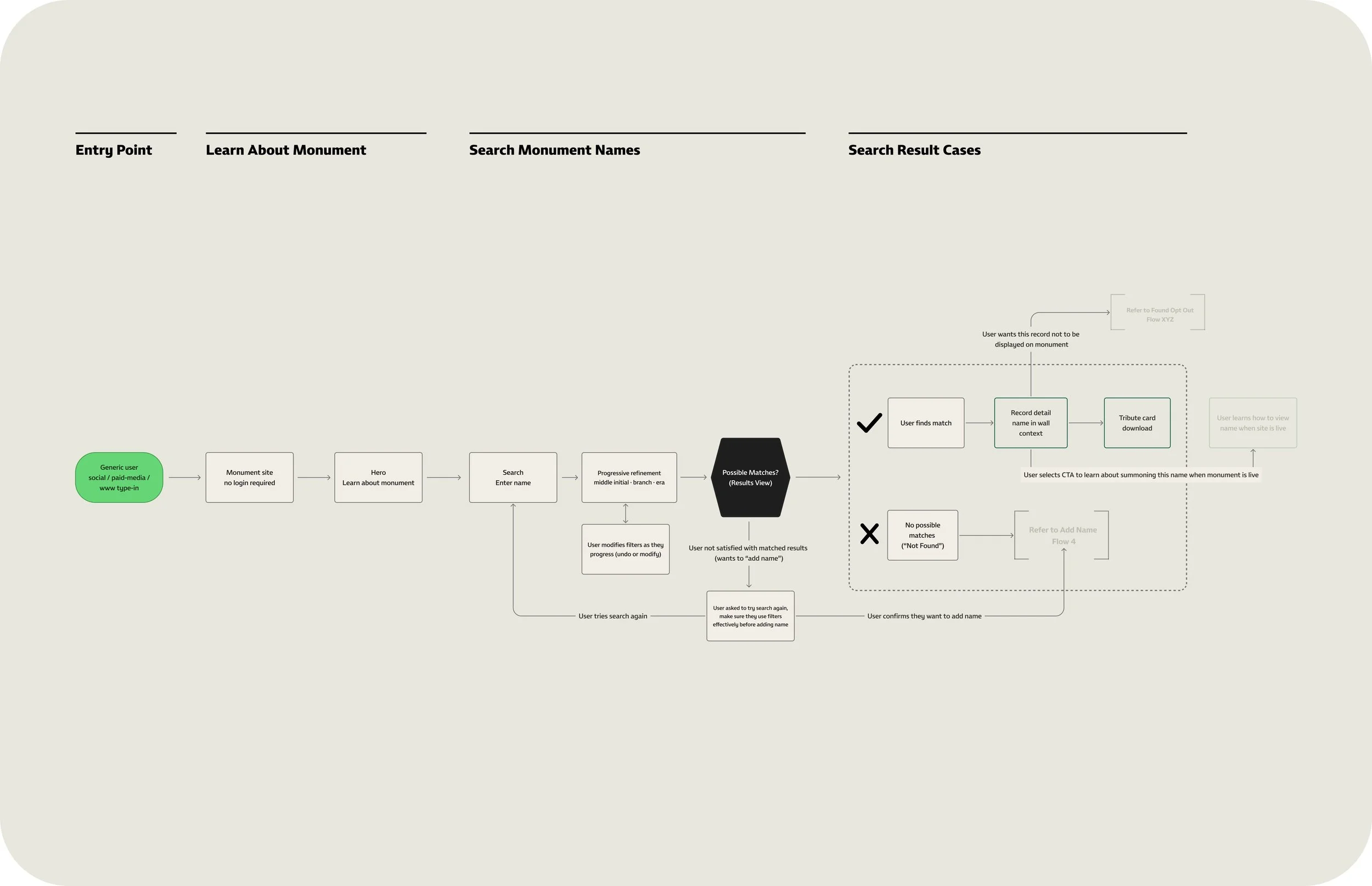
The visual system moves from public scale storytelling to personal remembrance without losing its character.
Working with Eddie Gomez, UX Lead, and Cindy Barrantes Calvo, Senior UX Designer, I used the established journey as a supporting framework identifying where contrast should increase, where the interface should become quieter, and where the brand could carry more emotional expression.

03 /THE FINISHED EXPERIENCE
The visual idea
in action.
The system shifts from public-scale storytelling to personal remembrance while keeping the same restrained character.
01 · DISCOVER
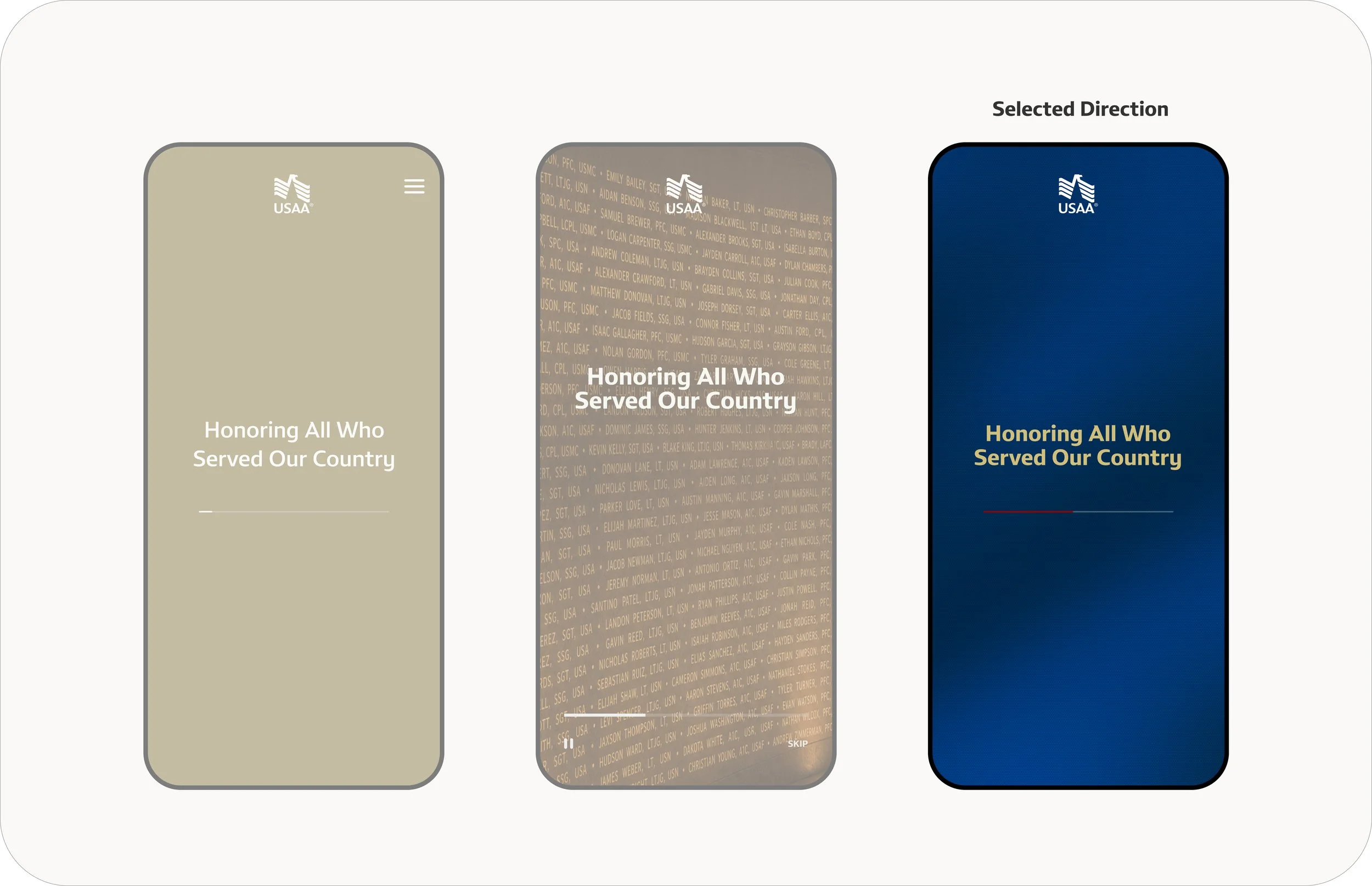
Establish a ceremonial tone.
Bold fields of navy, generous space, and measured typography introduce the monument without resorting to familiar patriotic or memorial clichés.
02 · FIND
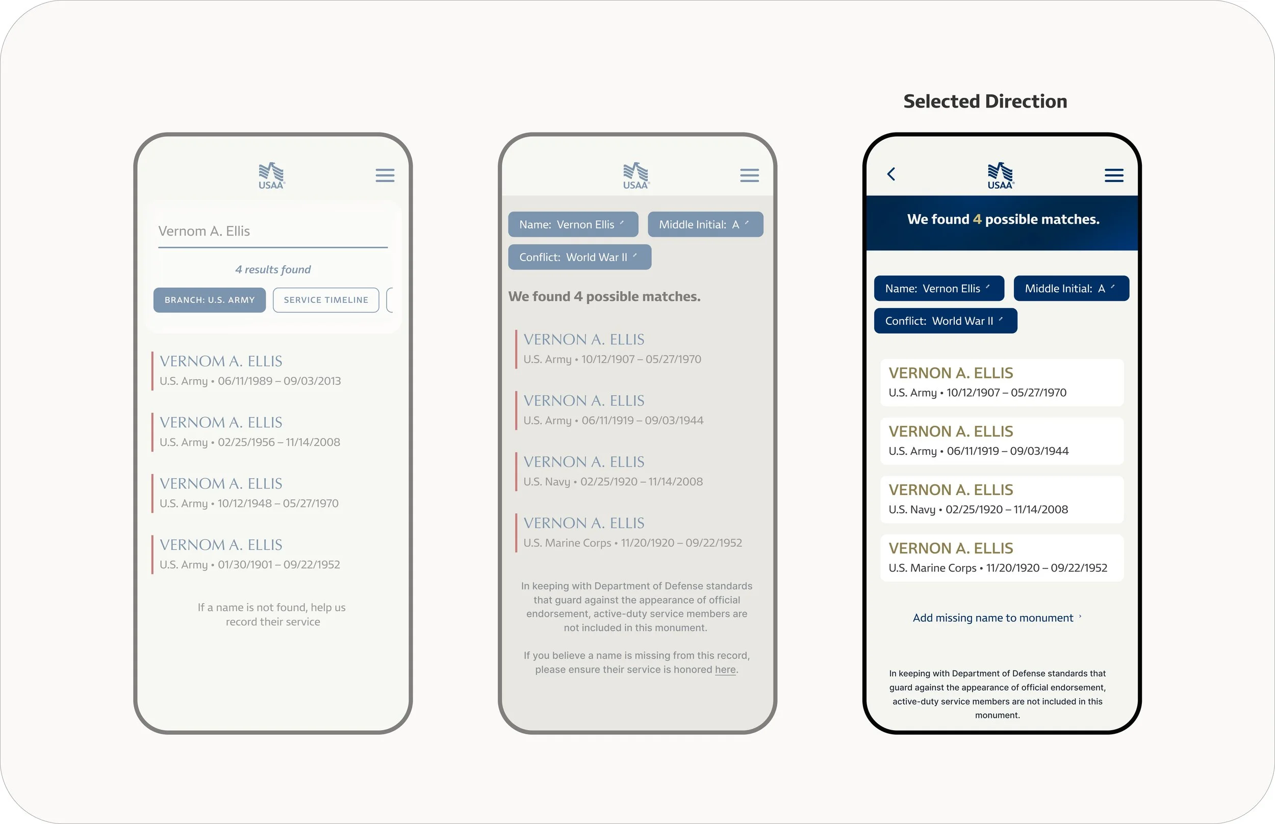
Bring clarity to millions of records.
Strong contrast, quiet surfaces, and differentiated type weights make dense historical information feel considered rather than clinical.
03 · HONOR
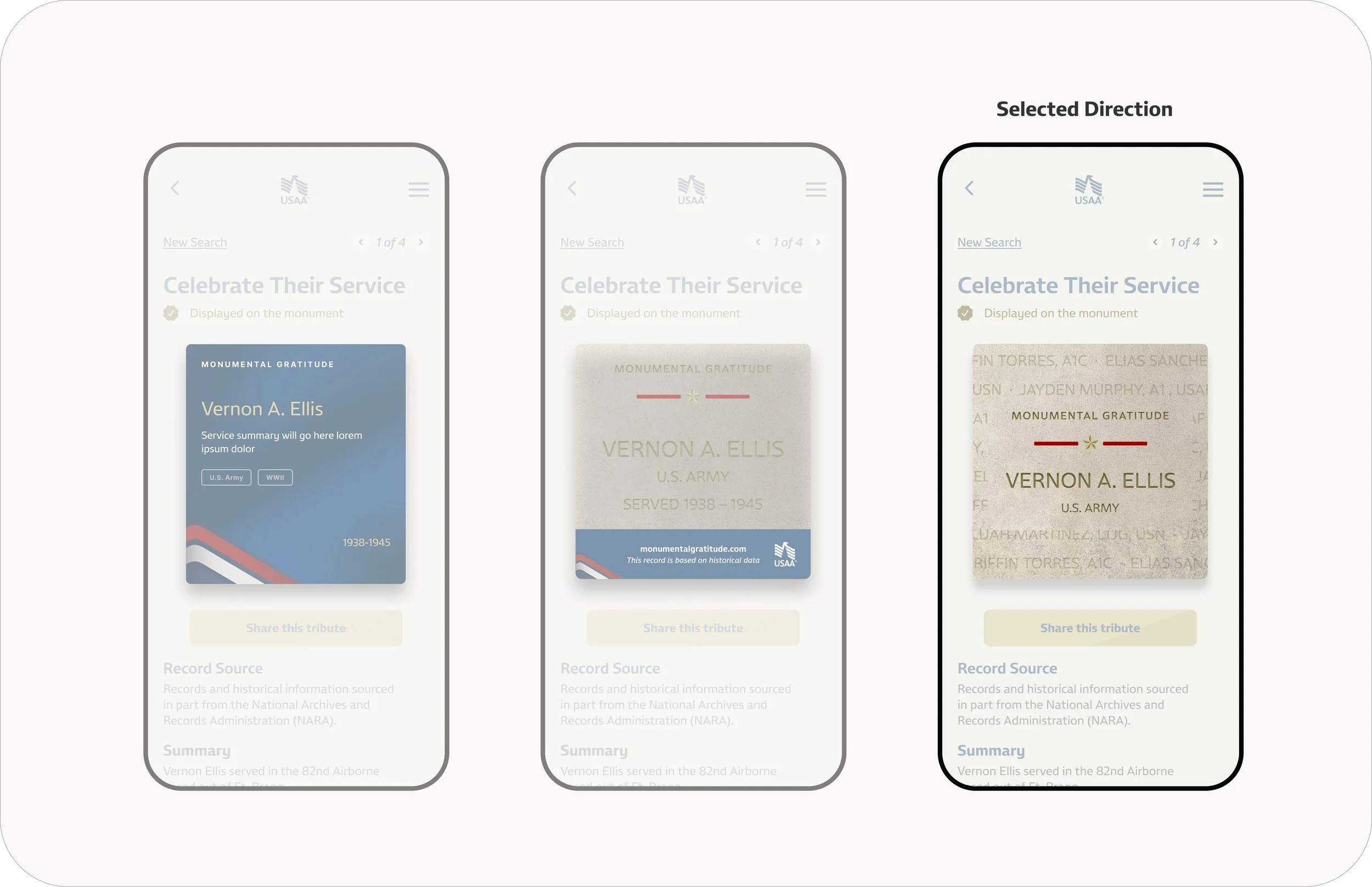
Create an object of remembrance.
The commemorative card draws from engraved stone, carved names, and the geometry of the physical monument—personal, permanent, and worthy of sharing.

04 / VISUAL DEVELOPMENT
Finding the right
weight and warmth.
01
Muted neutrals and photographic texture created atmosphere, but weakened brand recognition. The selected direction uses a deep navy field for authority, warm gold typography for dignity, and a simplified composition that gives the central message room to resonate.
Each direction was evaluated against three qualities: emotional tone, legibility, and connection to the physical monument.
03

Connect digital and physical
The selected card replaces a campaign-graphic feel with a tactile, stone-inspired surface. Centered typography, restrained ornament, and carefully weighted spacing give the service member’s name the prominence it deserves.
02
Establish the tone
Compose dense information
Navy filter controls, warm cream surfaces, and distinct white cards create
a clear rhythm. Changes in type size and weight make names immediately scannable while keeping service details present but quiet.
BRAND APPLICATION
Built from the brand.
Made for remembrance.
01 · COLOR
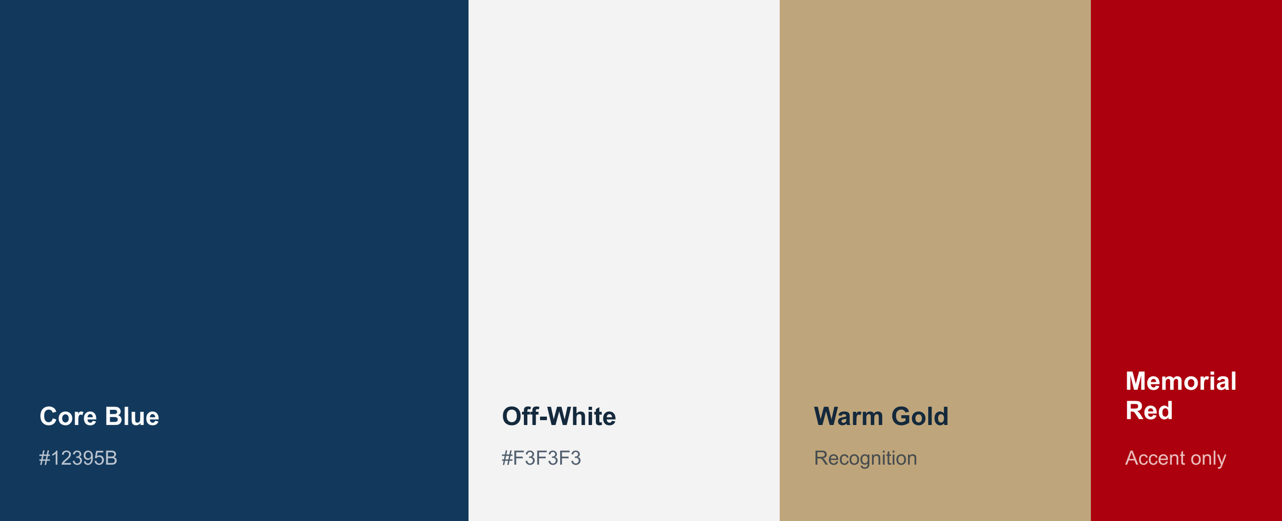
Core Blue anchors the landing and search moments; Off-White gives historical records room to breathe. Gold and red appear only at moments of recognition—the countdown, progress line, and tribute card.
03 · SIGNATURE
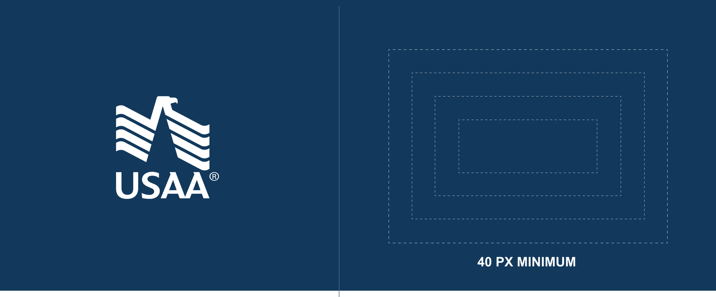
The vertical USAA signature is the consistent anchor
across the selected screens. It stays intact, centered
or left-aligned, with generous clear space and no added
graphic treatment.
The system begins with USAA’s approved color and logo rules, then uses the visual choices visible in the final experience: deep blue fields, warm neutral surfaces, concise type, and a restrained memorial accent.

02 · TYPE
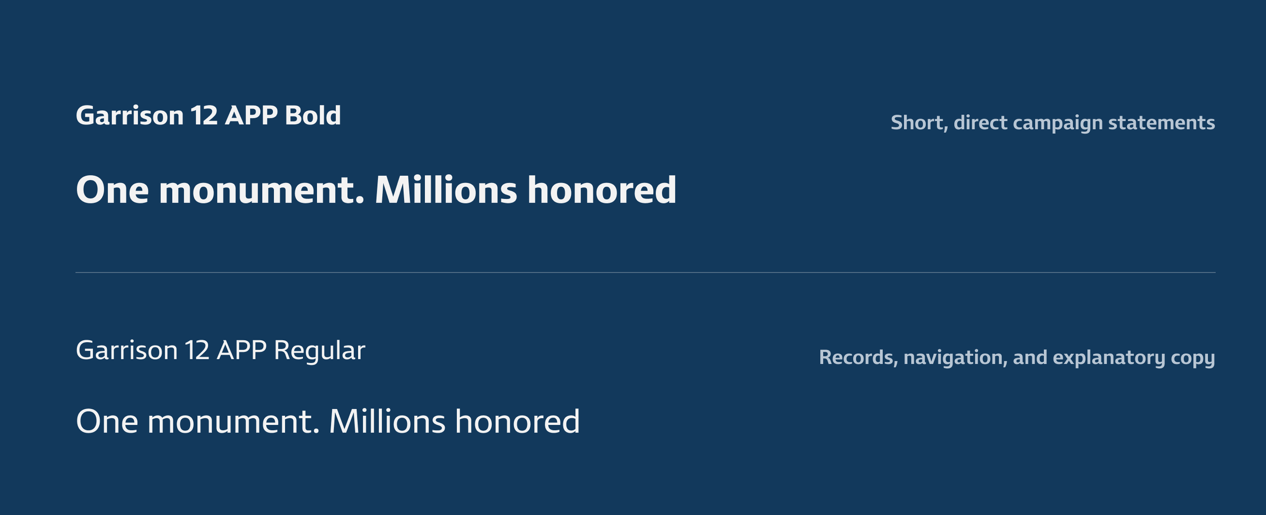
Condensed headlines carry conviction without taking
over the page. Sentence case, short line lengths, and lighter supporting text keep commemorative language measured rather than promotional.
04 · CAMPAIGN ACCENT
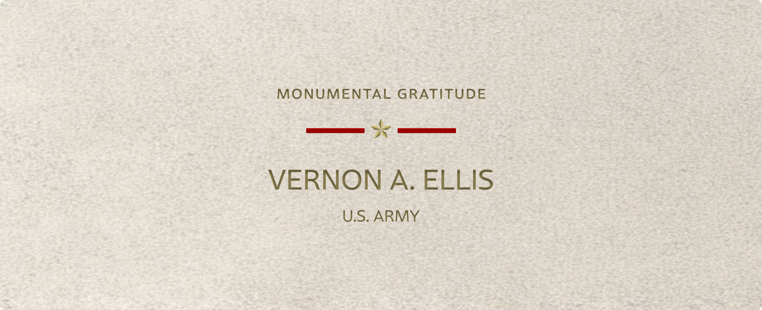
The red line and gold star are the campaign-specific memorial device already present in the selected landing, countdown, and tribute card. Repeating it at one consistent weight links those moments without introducing a new brand motif.